
 Posted by
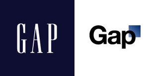
New Gap Logo
Yesterday Gap released the following statement:
Since we rolled out an updated version of our logo last week on our website, we’ve seen an outpouring of comments from customers and the online community in support of the iconic blue box logo.
Last week, we moved to address the feedback and began exploring how we could tap into all of the passion. Ultimately, we’ve learned just how much energy there is around our brand. All roads were leading us back to the blue box, so we’ve made the decision not to use the new logo on gap.com any further.
At Gap brand, our customers have always come first. We’ve been listening to and watching all of the comments this past week. We heard them say over and over again they are passionate about our blue box logo, and they want it back. So we’ve made the decision to do just that – we will bring it back across all channels.
In the meantime, the website will go back to our iconic blue box logo and, for Holiday, we’ll turn our blue box red for our seasonal campaign.
We’ve learned a lot in this process. And we are clear that we did not go about this in the right way. We recognize that we missed the opportunity to engage with the online community. This wasn’t the right project at the right time for crowd sourcing.
There may be a time to evolve our logo, but if and when that time comes, we’ll handle it in a different way.
Now comes the question: “Has the reputation of Gap as a clothing company taken a hit because of the failed new logo?”
It really is hard to say. The people in charge of deciding on the logo, certainly should have some explaining to do. Fans of the clothing brand most likely don’t really care about the logo debacle. However, it is poor publicity that the company will have to deal with both internally and externally.
We asked, internet marketing executive Jason Brown (not affiliate with Gap) about any potential problems this brings up for the company as a whole. He said, “If anything, this extra publicity may bring more attention to a brand that has excelled in a crowded clothing market for forty years. Gap already has established itself as a quality clothing company. Their business isn’t in making logos. It is in making clothing.”
The logo may not hurt the clothing brand from a sales point of view, but how about the price of Gap’s Stock? Shareholders want to invest in a company that makes good decisions, and hires the best employees to make those decisions. Could the new Gap logo crisis cause the share price of Gap Stock (GPS) to fall?
Currently the stock is up close to 5% over its price 1 month ago. If the stock price was going to take a hit, it probably would have already done so.
It looks as though Gap has made the right decision in reverting back to the old logo. The company may lose some respect as far as business management and marketing goes, but it shouldn’t hurt the short or long term revenues of Gap, Inc.
